Here is the research that I used to give me an idea on what I should put into my college magazine.
Front Covers

https://blogger.googleusercontent.com/img/b/R29vZ2xl/AVvXsEgtPOsZgBz9ep8Rj1E1ux9lUrsJeifWbCN6HkaCPvK0jLUliYvikh-O9_tFjPorgp-SkodR6BemOwrcEH9yrO-tTA1UgfHSqFAGYShtdswKN-OQ77frj-6KppjI1hgaRGYeOVZtc6LwIiMf/s1600/college+magazine+2.jpg
I like the black/gray/white background on this magazine.
I don't like how much clutter there is around the page, to me it seems like there is too much on the cover.

http://behance.vo.llnwd.net/profiles4/118428/projects/692711/87db20f6144e66554408975fa5d7bebb.jpg
I like the colour scheme of this cover, the blue and yellow text fits well with the background.
I also like the font and how some less important text is a smaller size than other more important text.

https://blogger.googleusercontent.com/img/b/R29vZ2xl/AVvXsEiZodIF8c4XZSRly_t93LPP7ZNBm4fic6vkH3qHBLvRwHNd937TEGP6rDjEJ-L9tmFL2aV8kXMS5wb1PCHI1a_5IrDmzpqoV2lU1pBblJtTye2HQ89ZGphLOvVKXdS1RJ73H5d_jg766V4/s1600/college+magazine+1.png
I don't like the editing on this cover, nothing seems to blend well together and there is too many different colours.
I do like how the cover clearly shows the magazines low price as this will tempt more people to buy it.

http://bradmedia.weebly.com/uploads/1/0/7/6/10760910/6146100_orig.jpg
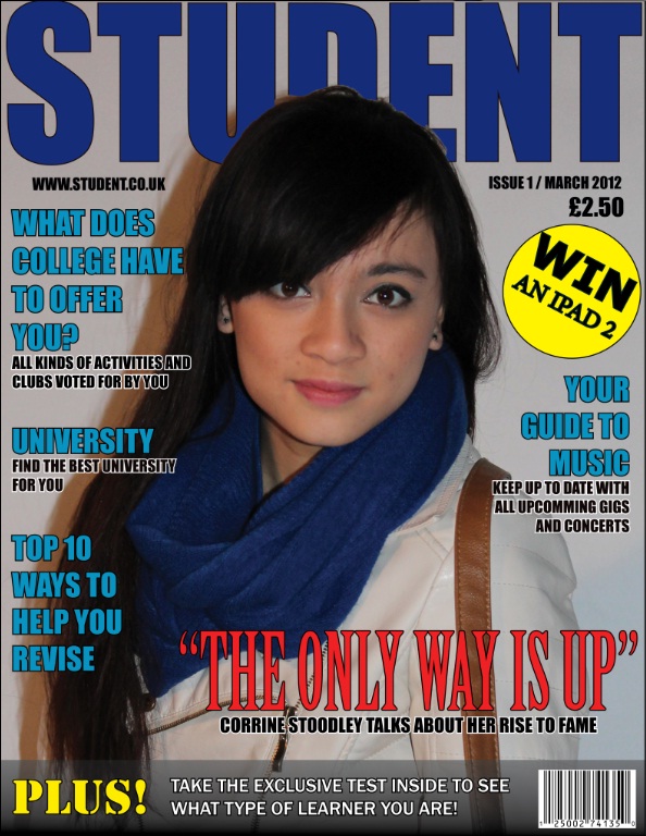
I like how this magazine has a variety of contents, from revision tips to new music and prizes.
Contents pages

https://blogger.googleusercontent.com/img/b/R29vZ2xl/AVvXsEjfY_9VbGXEcegdWNpTeUqKu8GtfZ6W-mQipMyXSVbj9lrzO48TP9U0scG9NQ1uCxQ65GuHohSQmiHYqgVGysMNHqM7SsxYrwzAvQnv1rhXXTq4xvo1Rmj9fuIuVC6EJGgj_y_w1cDtY_kY/s1600/contents+page.jpg
I don't like how inconsistent the text is on this contents page, some is higher and thinner when it doesn't seem like it should stand out in any way.
I do like how the colours contrast on this contents page.

https://blogger.googleusercontent.com/img/b/R29vZ2xl/AVvXsEjfyjoPqrWsSms52bZMSH65AusiBssdLbYzVx2saXBeN_cpkaQxGQhJMMJb2D2QIhHqOevrba8ZBDjNyFH67RBjb25Qx_1fjPpTusdXShAfdyE8NWHY1qEt_jQi8k9-fyaDCmtGeZUWzc91/s1600/Example+1+contents.PNG
I don't like how squished the text is.
I don't like the borders of the images because they are different sizes and widths and it looks inconsistent and rushed.

http://jadeheagren8.files.wordpress.com/2010/09/contents-page.jpg
I like how professional this contents page looks.
I like the how the background fades from one colour to another.
I like how all the information is spaced out, giving it a tidy, organized look.

http://shaunaharrendence.files.wordpress.com/2009/10/2175964086_25f79a70ca2.jpghttp://shaunaharrendence.files.wordpress.com/2009/10/2175964086_25f79a70ca2.jpg
I like the symmetrical design of this contents page.
I like how organized the layout of the text is, the different pages are split into categories.
No comments:
Post a Comment